
Walgreens Card Art / System
Client
Synchrony, 2024
Role
Art Director
Industry / Product
Finance / Consumer Credit Cards
Deliverables
Credit Card Art / Credit Card Brand System
I developed a cobranded card art system for Synchrony, debuting with the Walgreens credit card. The goal was twofold: to design card art where Synchrony branding appears on the face of the card in a way that could scale to other retail partners, and to establish clear rules for how Synchrony shows up as a partner brand—always secondary to the retailer. My approach explored how design details—such as texture, notching, and color blocking—could further define hierarchy, improve ease of use, and enhance identifiability in the wallet. I iterated on the size and placement of Synchrony elements to ensure visibility without detracting from Walgreens’ equity, while testing features like a gold color band or a distinctive notch to make the card stand out both visually and physically in a crowded wallet. The resulting system balances Synchrony’s presence with retail brand recognition, creating a scalable framework that is both functional and brand-consistent.
Concept Development
For the Walgreens card, I explored several creative directions to showcase its strong, customer-recognized identity within the newly defined system. Each concept thoughtfully prioritized Walgreens’ equity by featuring its signature red, iconic “W,” and familiar cues, while integrating Synchrony branding in a clear but subordinate role. Design elements like color blocking, distinctive notches, and bold vertical layouts made the card visually memorable while meeting functional and brand hierarchy requirements.


Final Concepts
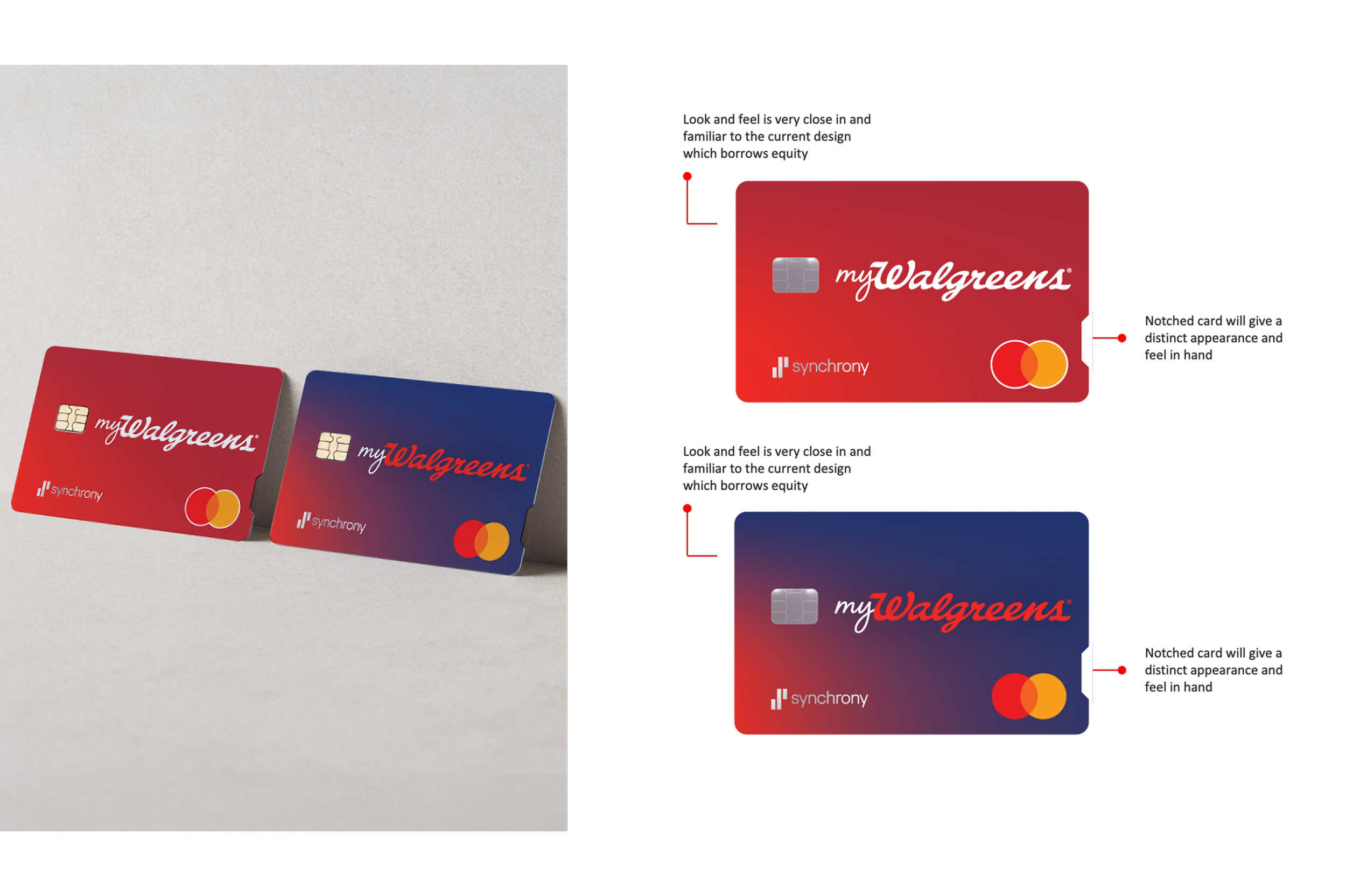
Concept 1: Close to the Core

Concept 2: Subtly Stunning
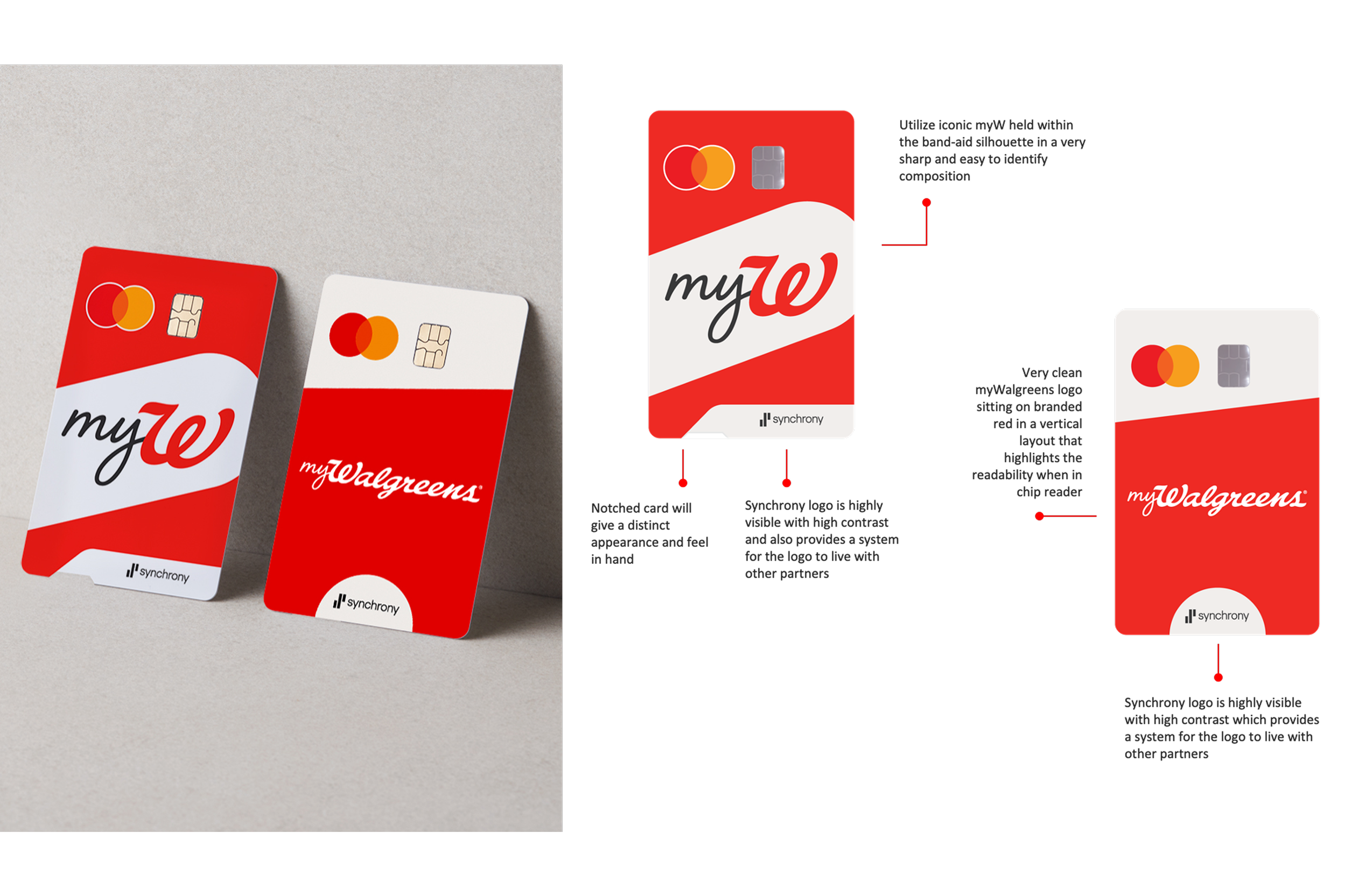
Concept 3: The Knockout